Why Most Traders Misread Nifty
Most traders think Nifty movement is unpredictable - a noisy chart driven by news, emotions, and luck.
That belief is expensive.
Because beneath the chaos, the market follows a structure.
Not perfectly, but consistently enough to exploit.
What if you could strip away the noise… remove human bias… and let a simple mathematical rule tell you when a bull run actually begins - and when a bear phase is still far from over?
This isn’t about predicting the future. It’s about decoding what the market is already doing - with clarity most traders never reach.
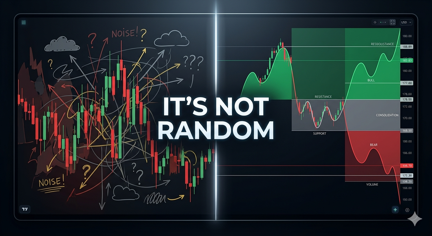
Decoding the Nifty Cycles
Look at the Nifty chart. Although it looks like a random walk, it's not.
The market moves in distinct, mathematically measurable cycles technically called Bull and Bear phases.
I will show you the movement using a simple algorithm that strips away human emotions.
Instead of guessing where a bull market started or a bear market ended, the algo mathematically flags local extremes. By strictly defining a "Bull Phase" as a confirmed 20% rally from a bottom, and a "Bear Phase" as a 15% drop from a top, we can slice the historical Nifty data into definitive bull and bear phases. I know you are thinking, why 20% and 15% and not any other number. Because its generally accepted bull bear boundary.
Having said that, you are free to choose any arbitrary number. The findings will be the same.
Real Market Phases
You can see the result in the colored bands: the explosive green Bull Runs, the punishing red Bear drops, and the gray zones of sideways consolidation. For every phase, system calculates two crucial dimensions:
- Duration: Exactly how many months the cycle lasted.
- Velocity: The percentage change in nifty over that time.
It's crucial to understand the implication of duration and velocity. A 40% drop that takes two years is a exhausting bleed. But a 40% drop in two months is a violent shakeout - weak hands out, strong institutional buyers in at wholesale prices.
What to observe
The algorithm strips away daily noise to reveal the market’s underlying structure. When analyzing the colored bands, traders should observe three key patterns:
- Asymmetry of Time: Notice that Green Bull phases are significantly wider than Red Bear phases.
- The "V-Shape" Signature: Look at the 2020 COVID crash. Rapid, steep drops (high velocity) often lead to the most explosive recoveries.
- The Power of Duration: A slow, multi-year decline is an exhausting bleed for your capital. Conversely, a 20% rally that takes months rather than years indicates strong, high-conviction momentum.
The gray zone identifies consolidation. If no regime is triggered, stay patient and avoid over-leveraging.
| Feature | What it Represents | Actionable Insight |
|---|---|---|
| Band Color | Market Regime | Green = Buy Dips; Red = Protect Capital/Short. |
| Band Width | Cycle Duration | Don't exit Green too early; Don't stay in Red too long. |
| Slope Steepness | Market Velocity | Steeper slopes = stronger conviction/panic. |
The Real Edge
The table quantifies each market phase by duration (time) and velocity (% move). The real edge lies in interpreting their combination, not just identifying whether the market is bullish or bearish.
The Bear phase (Sep 2024–Mar 2026) shows a ~12.96% decline over ~18 months, classified as High duration and Low velocity. This represents a prolonged, slow-moving decline rather than a sharp capitulation, indicating persistent weakness but no panic bottom yet. Such conditions typically do not favor aggressive buying and often lead to extended consolidation or gradual downside.
Always map the current phase on the duration-velocity framework.
Use Historical Patterns for Action
High velocity declines signal potential capitulation and reversal, while high duration with low velocity reflects distribution, drift, and the likelihood of continued weakness or sideways movement.
- Best buying opportunities: Low or Medium duration combined with High velocity Bear phases. These fast, high-intensity crashes (e.g., 2008, 2020) tend to exhaust sellers quickly and lead to sharp V-shaped recoveries.
- Strong Bull confirmation: High duration with Medium to High velocity Bull phases signals sustained institutional accumulation. These phases offer the highest probability trend-following opportunities—buy dips and ride momentum.
- Shorting opportunities: High or Medium duration combined with Low velocity Bear phases indicate slow, grinding declines where rallies are weak and tend to fail.
- Avoid low edge zones: Low duration and Low velocity phases are noisy, short-lived, and lack follow-through, making them prone to whipsaws.
Can you identify which phase we are in now and what action should we take. The whole objective of this analysis is to answer this question without ambiguity. Hopefully from now on, you won't misread nifty chart. Happy Investing !
| Market Regime | Duration | Velocity | Actionable Strategy |
|---|---|---|---|
| Bear Phase | Low / Medium | High | Aggressive Buy (Best Opportunities) |
| Bull Phase | High | Med / High | Trend Follow (Buy Dips & Ride) |
| Bear Phase | Med / High | Low | Shorting Opportunities (Sell Rips) |
| Any Phase | Low | Low | Avoid (Low Edge / Whipsaw Zone) |